Managing body-building goals
A major part of body building is making progress - progress towards a desired physique, improved health, strength or consistency, to name a few.
Role
Lead Designer
Platform
iOS App
Project Timeline
May — Nov 2023
Project Status
In Development
CONTEXT
Tracking training progress looks different for everyone and is based on each person’s unique situation.
Part of the product’s purpose is to provide a smooth way for trainers to set and track progress towards achieving their goals.
THE CHALLENGE
Creating a system: Each person & situation requires a different set of training goals. What could these goals look like? How can we create a tracking system to cater for most situations?

IMG
Managing a workout set
This feature aimed to create a customizable way for trainers to measure progress towards their goals
Design principles to guide success
Since this was the first product iteration with no budget for extensive user testing, we defined 5 core design principles to help us evaluate the effectiveness (not success) of each feature, screen or flow we created.
Simplicity
As I came to learn, body building isn’t just about lifting weights - it includes understanding some complex concepts. The final product should always make these concepts easy to understand. Trainers need to focus on getting reps done, not spending time figuring out how the app works.
Show don’t tell
We ditched long walkthroughs that would easily be forgotten for simple, context-driven designs that could explain complex concepts.
Re-usablility
We had to make sure that the elements used to collect and display data to trainers could be reused. Since each goal type had different input & summary requirements, reusing elements within each flow would make it easier for trainers to understand the different contexts.
Error prevention & easy ‘undos’
All our design decisions had to make it harder for preventable user errors to occur. But if the trainer made a mistake, we had to always make it easy for them to take back that decision.
Visibility & clarity of context
Most of the app’s flows require multiple steps and responses. Trainers should be able to tell what inputs they have provided at any point in time.
DESIGN & ITERATIONS
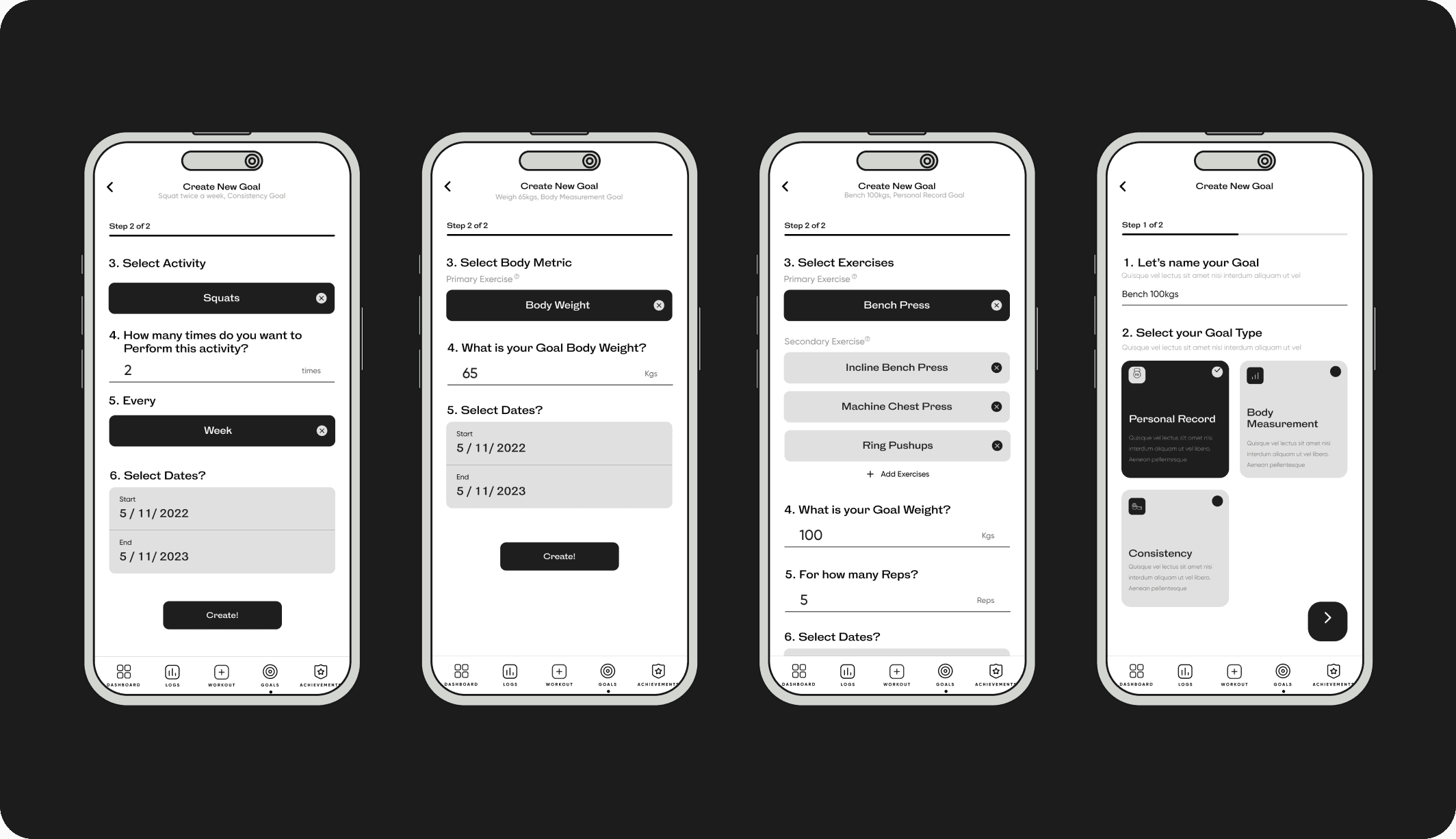
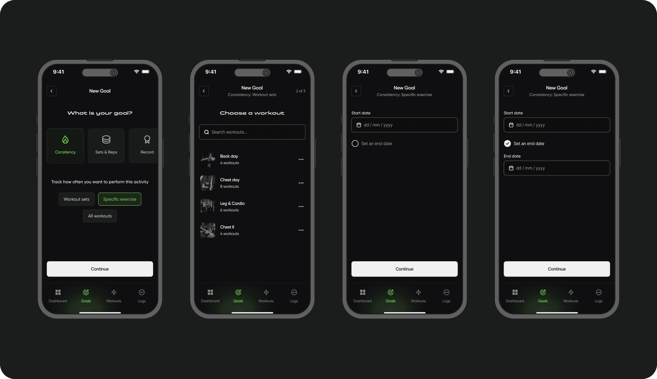
Each goal type has different requirements that need to be properly tracked. I designed several iterations until I found the most effortless way to create goals.

IMG
Grouping goals types under 3 main categories (Consistency, Records and sets & reps targets))
Iteration #2
In this iteration, I explored how we could guide trainers through the goal creation process in a procedural manner, based on the type of goal they wanted to create. This version fell short mainly because the process of switching/making changes while setting up a goal took too long.
Iteration #3
This iteration was a good option because it provided concise explanations to the trainer as they went through the goal creation process. However the UI had a tendency to get to text-heavy, which wasn’t in line with our design principle of “simple but appealing”.
Goal summary iterations
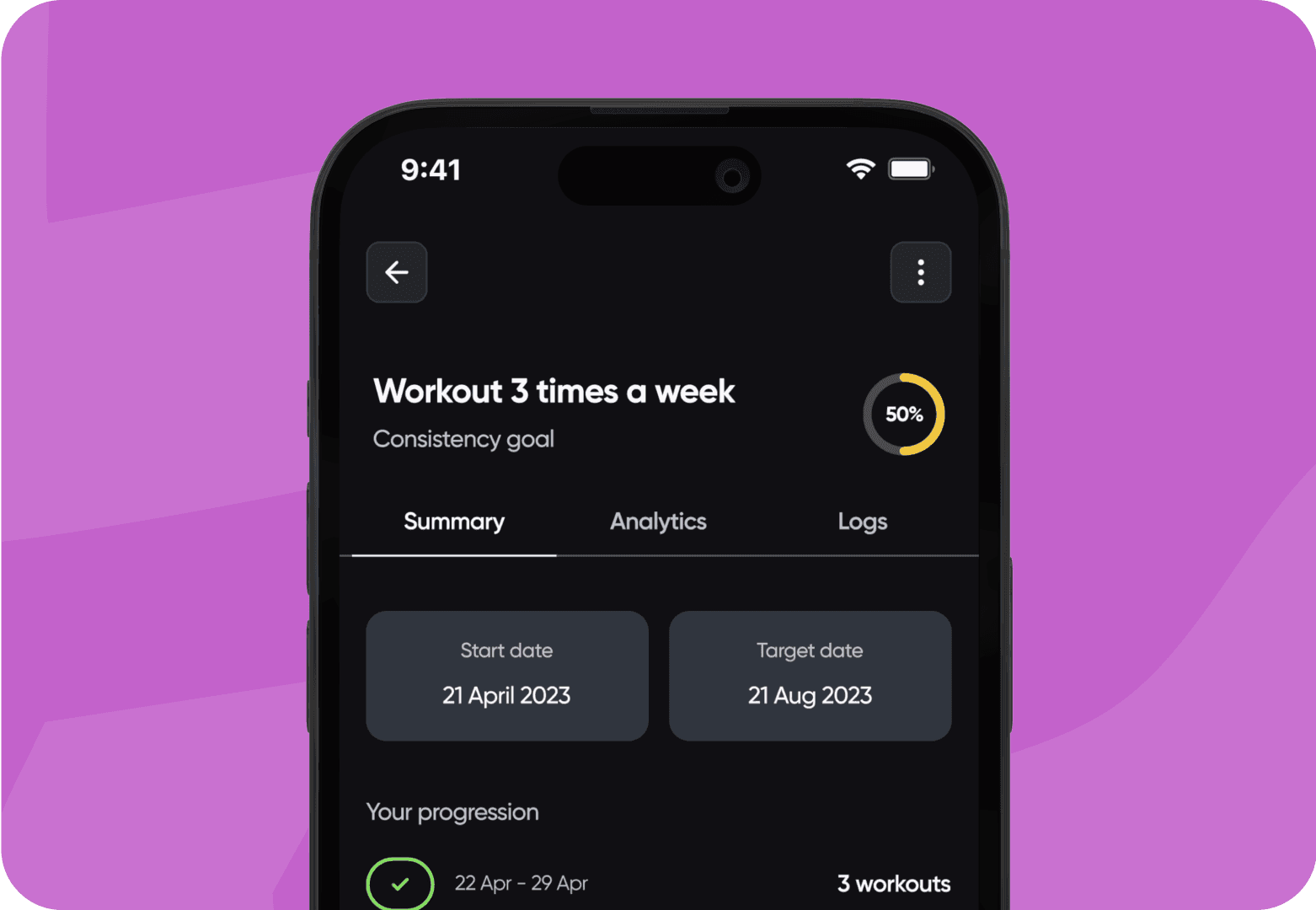
Compared to the goal creation process, this was much easier to set up using the design system elements I’d created for our component library. Elements like navigation, charts and log modals were already available, so putting the final flow together was a breeze.
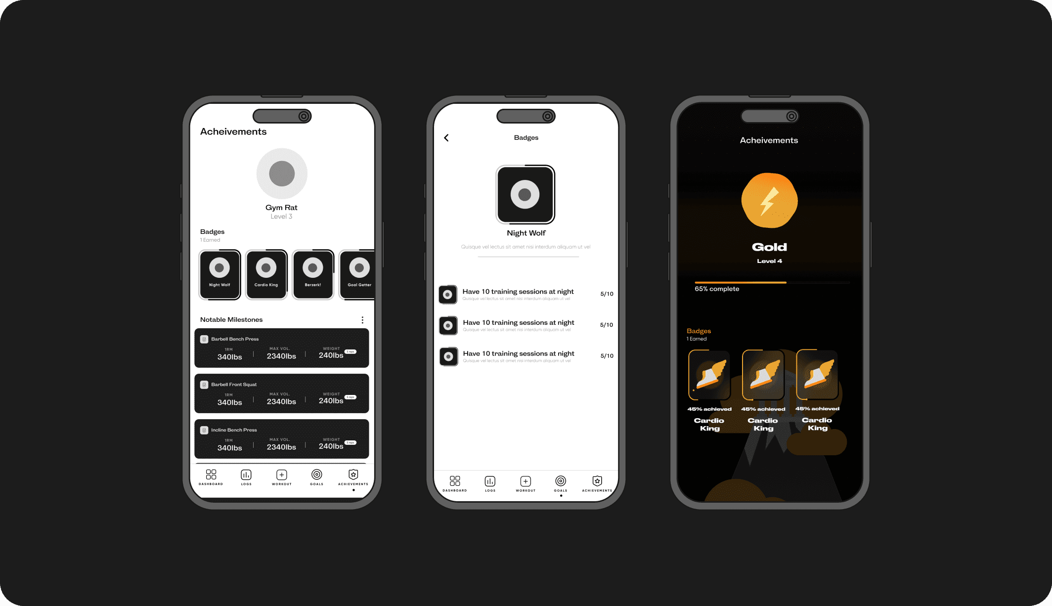
Achievements page iterations
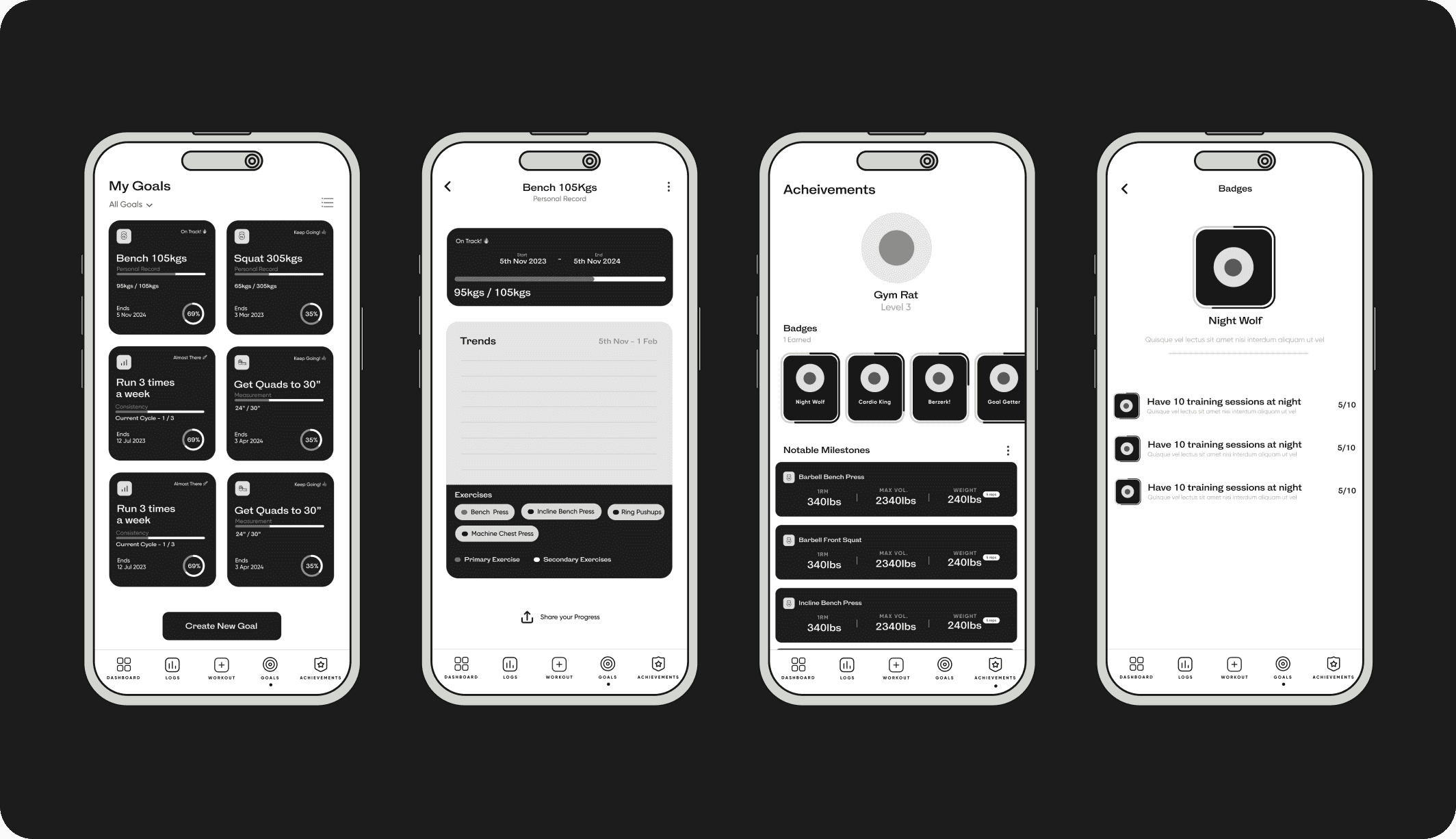
Earning badges and unlocking achievements isn’t a focal feature in the product, but we still needed a way keep their existence top of mind for trainers.
IMG
CLIent wireframes for achievement flow
Hey👋🏾👋🏾👋🏾!
Check these projects out too👇🏾
Sections

